DUPLOS
Identidade visual e campanha
Visual identity and campaign
Identidade visual e campanha
Visual identity and campaign
Briefing: Desenvolver marca e campanha de divulgação para os encontros de Duplos, projeto de improvisação entre música e dança que acontece durante o ano todo.
Briefing: Develop the brand and communications campaign for the encounters of Duplos, the project crossing music and dance in improvisation sessions all year long.
Estratégia: Construir um caminho flexível que possibilite trabalhar o evento de maneiras diversas ao longo do ano sem perder a unidade visual.
Strategy: Build a flexible path to enable the communication of the event in different ways throughout the year without disturbing the visual unity.
Ideia: Criar uma identidade dinâmica que reflita a linha de trabalho de Duplos: a improvisação e o diálogo entre as linguagens da música e da dança.
Idea: Create a dynamic identity that reflects the line of work presented at Duplos: the improvisation and dialogue between the languages of music and dance.
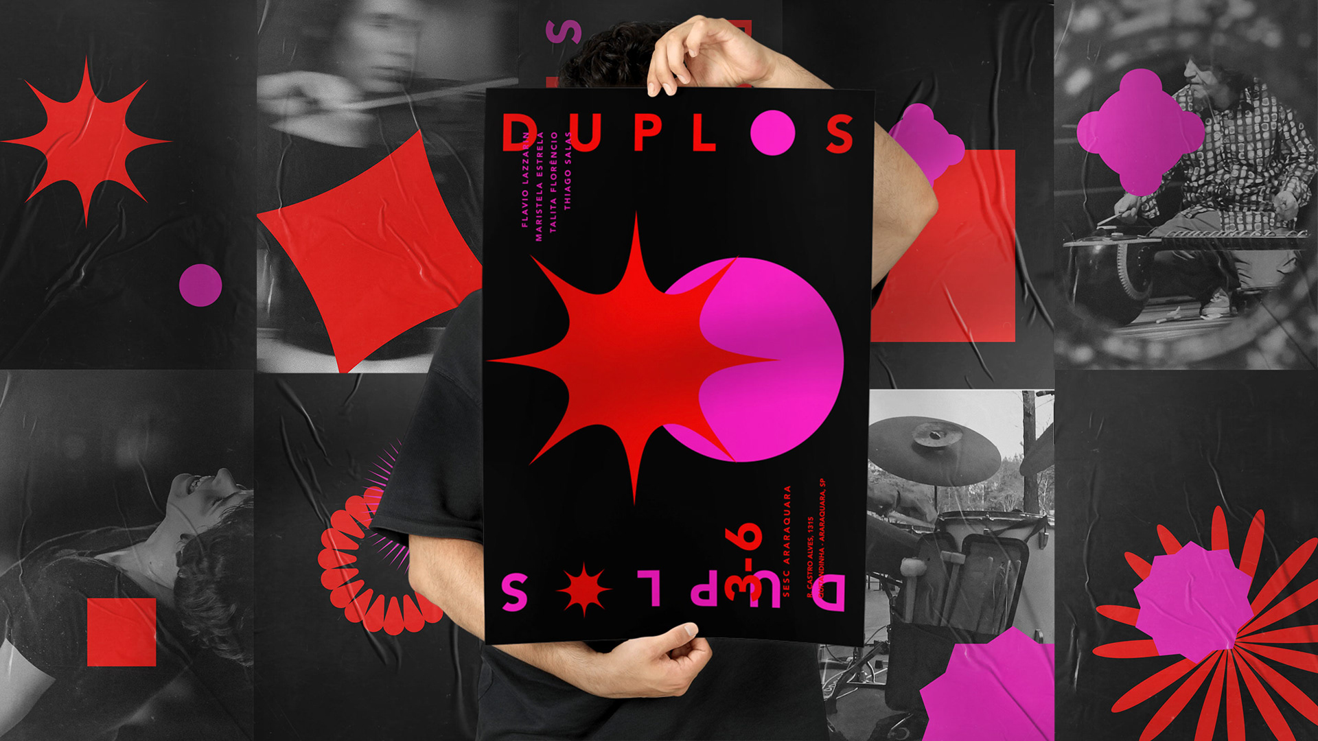
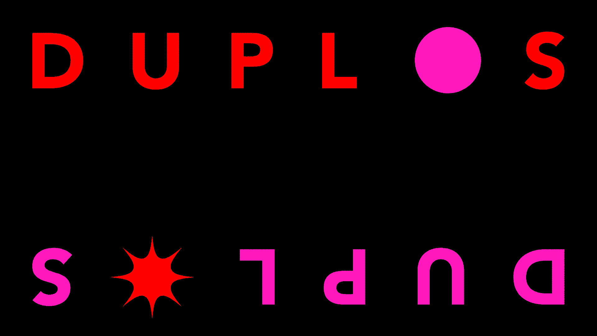
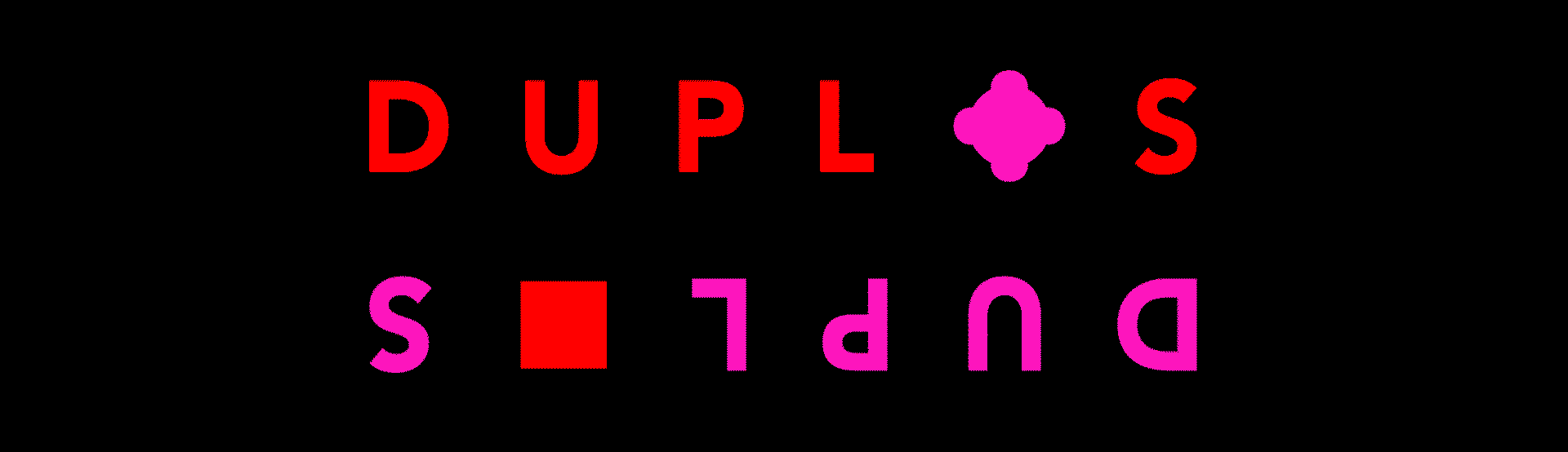
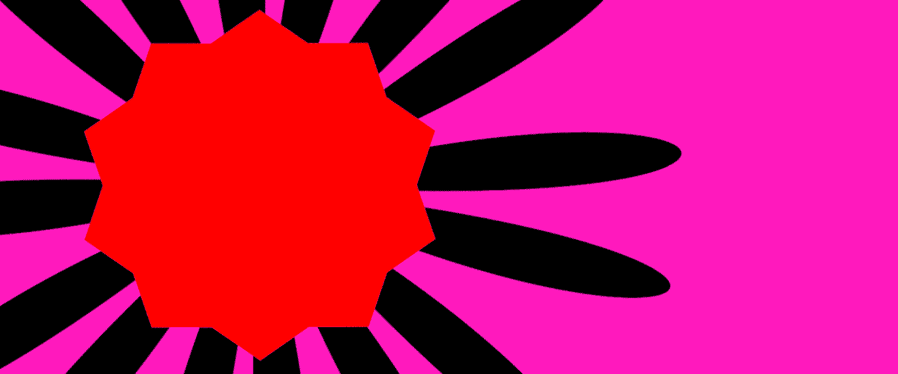
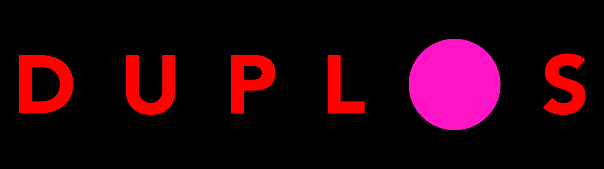
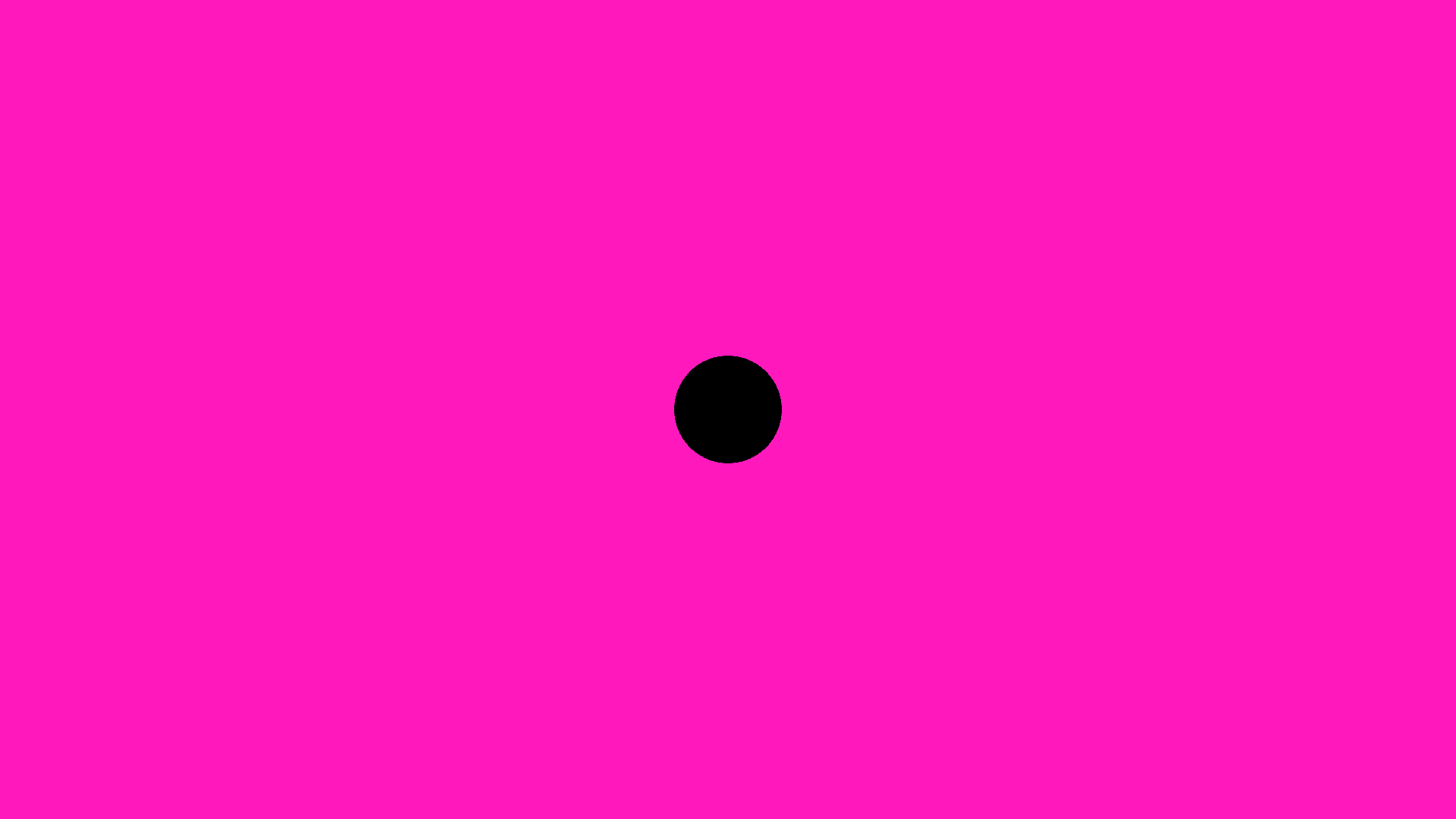
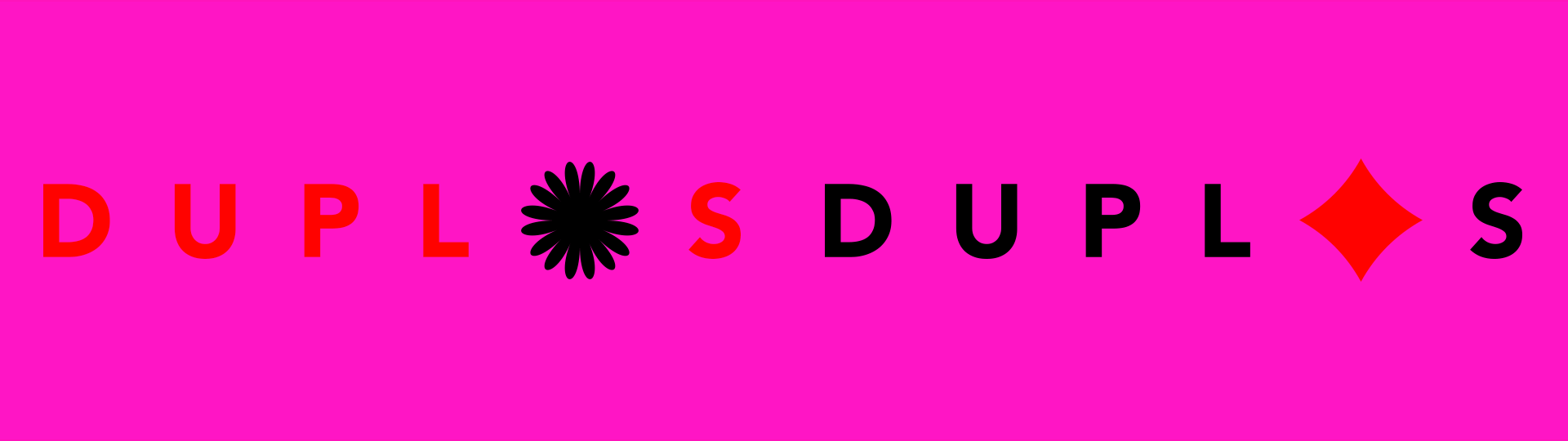
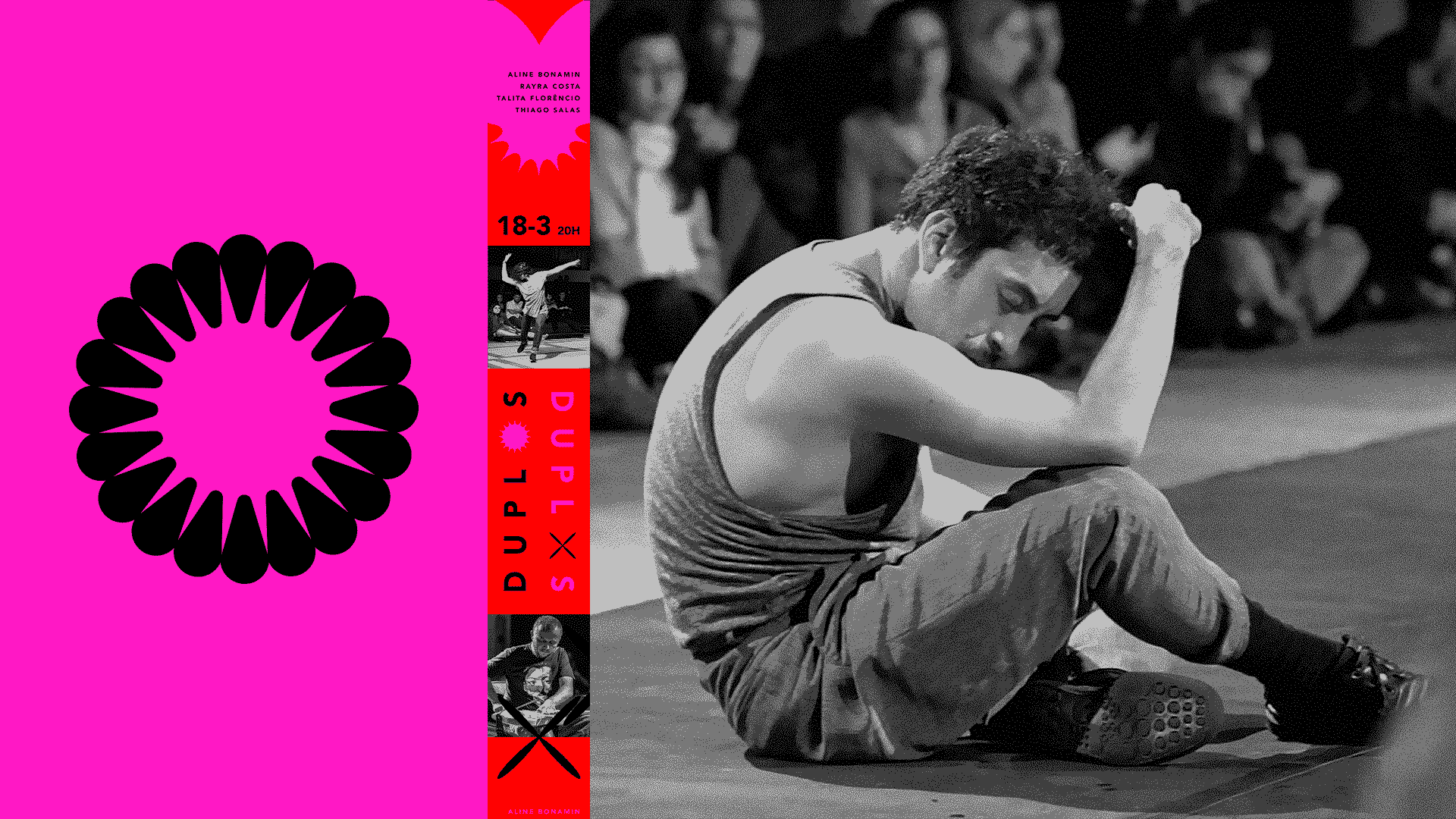
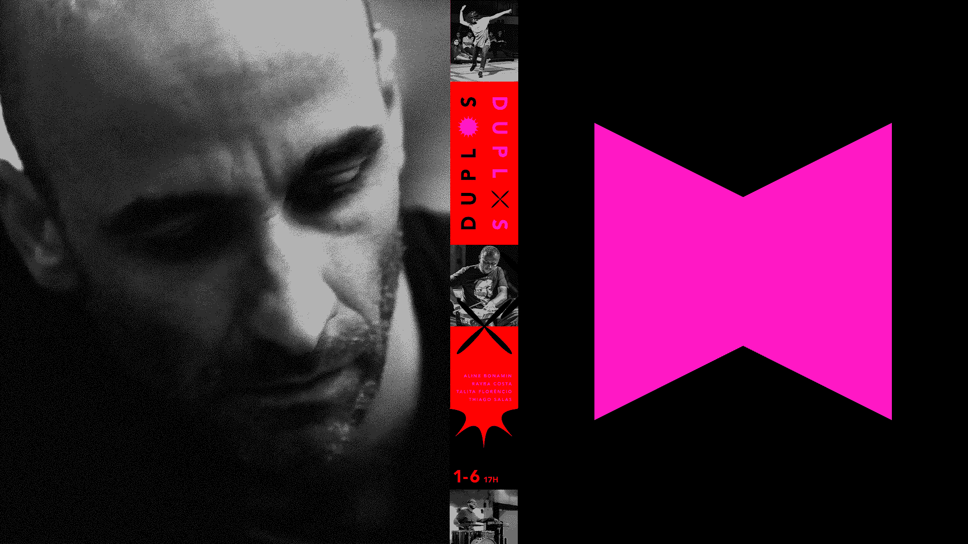
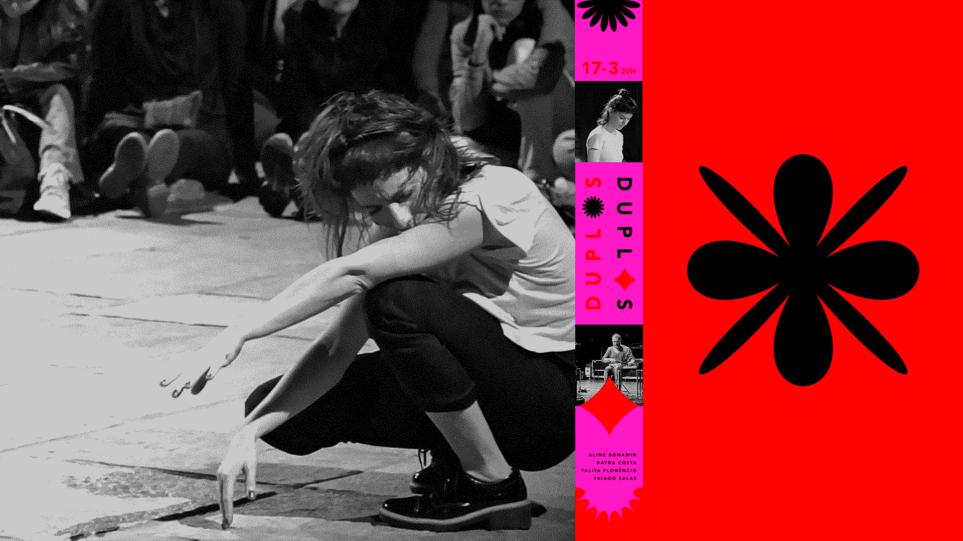
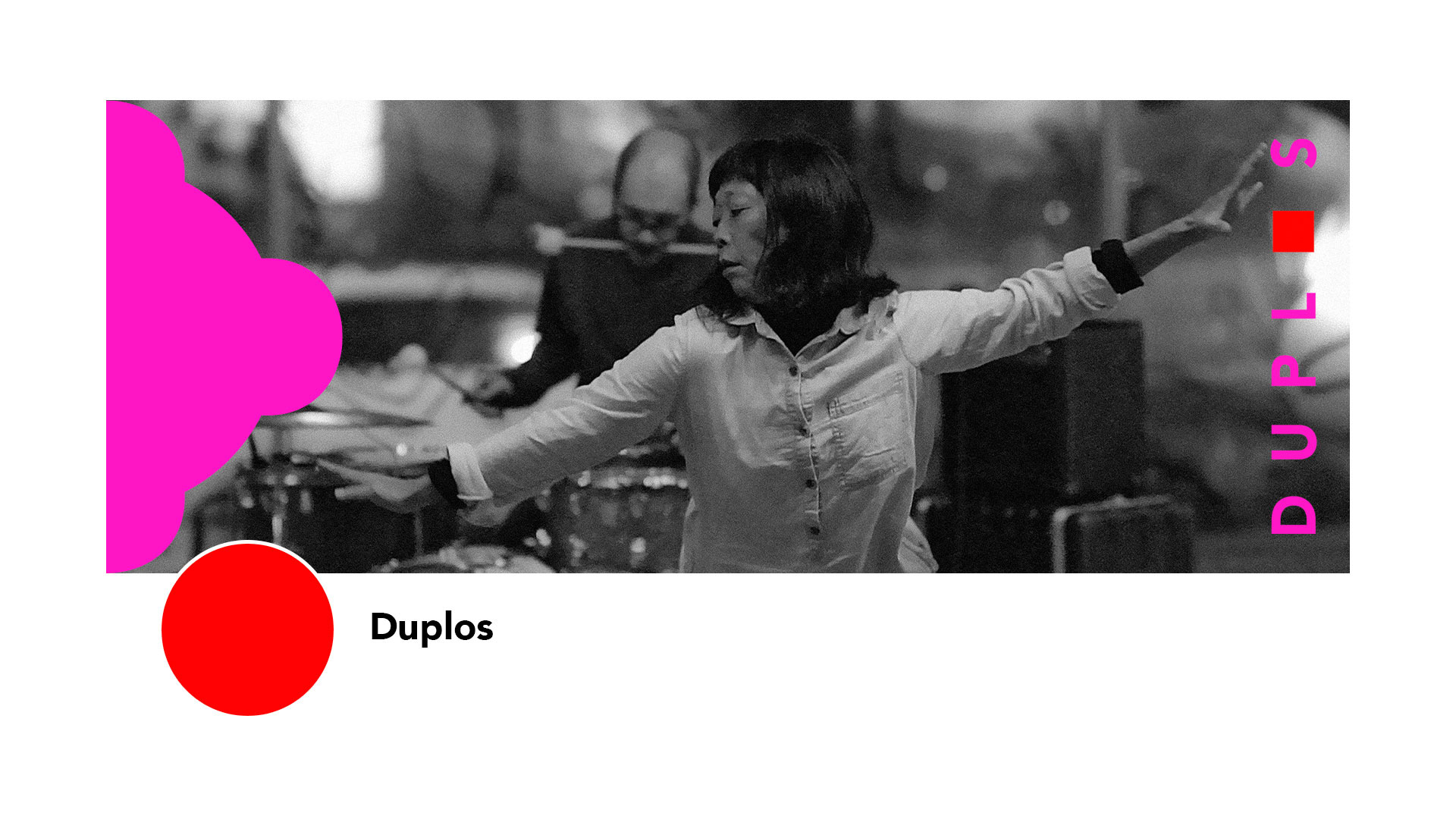
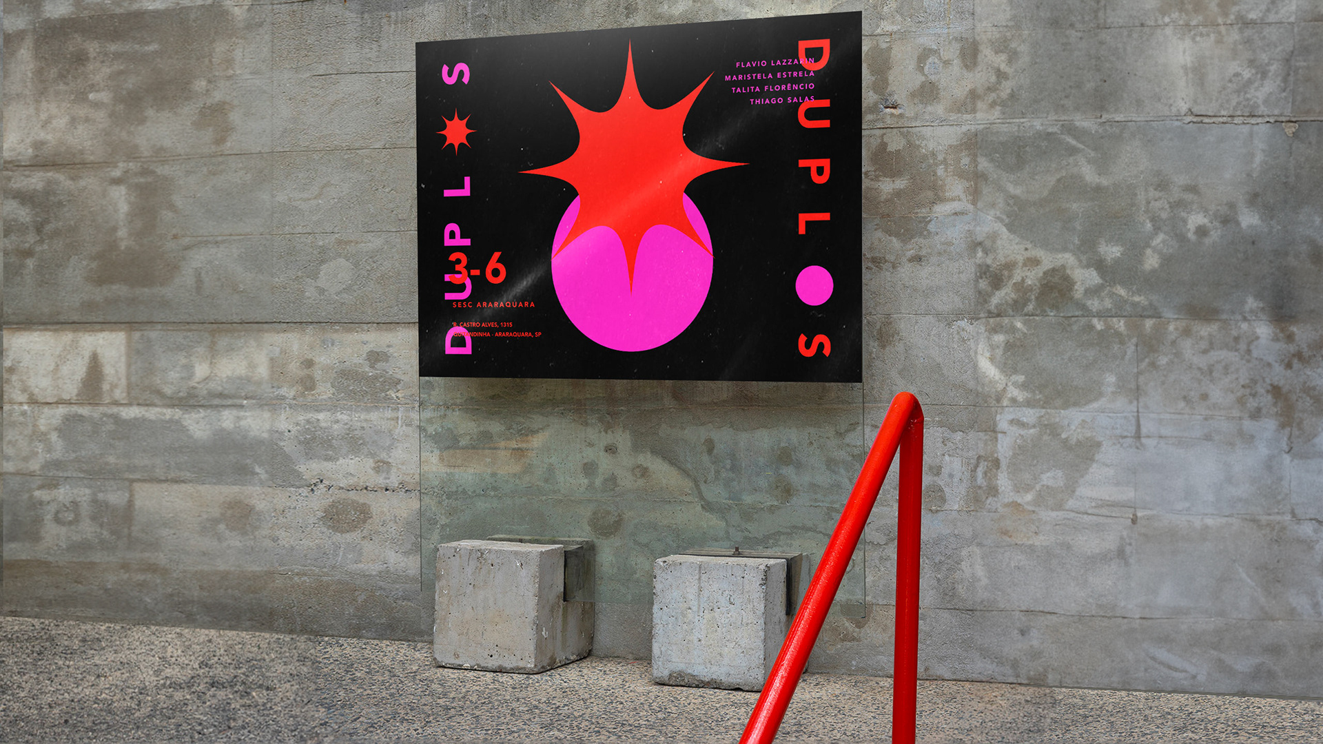
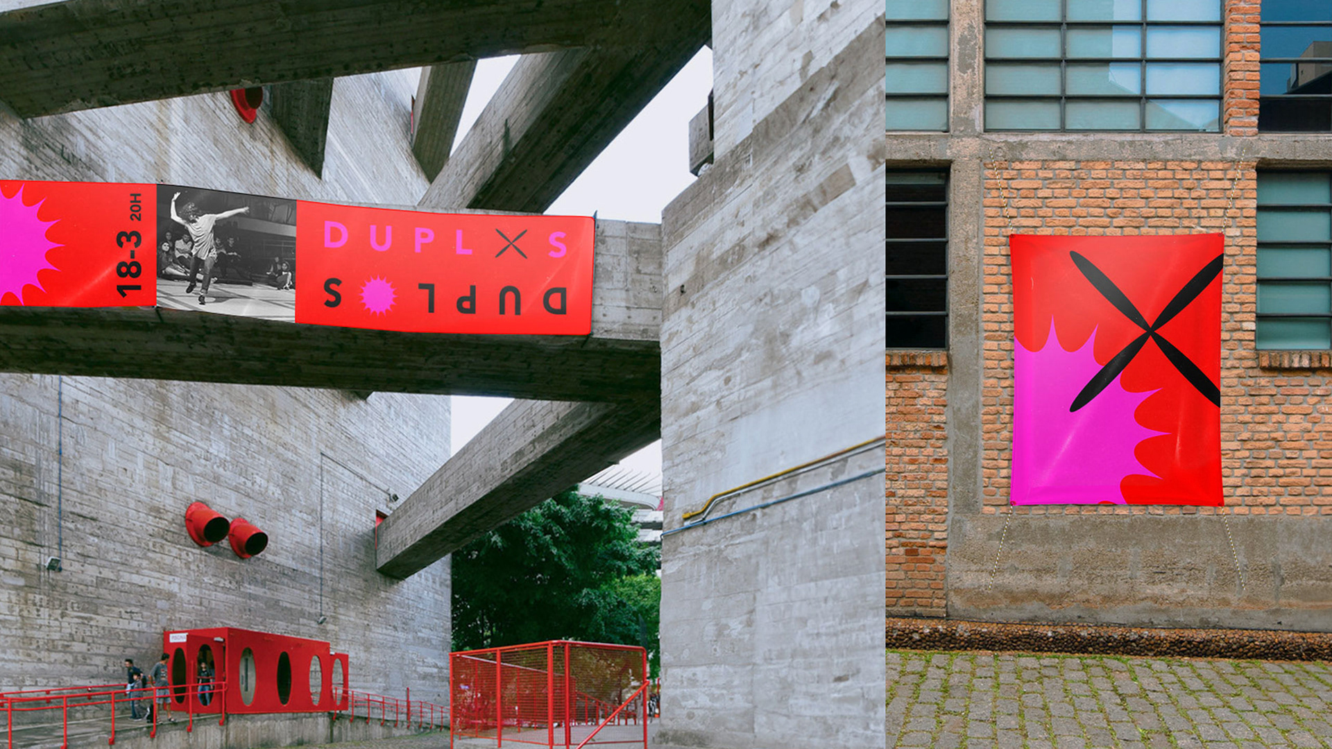
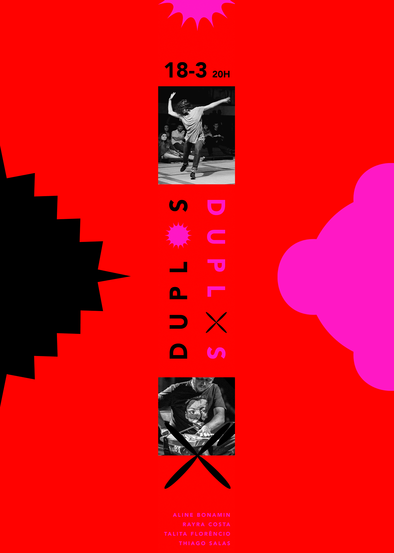
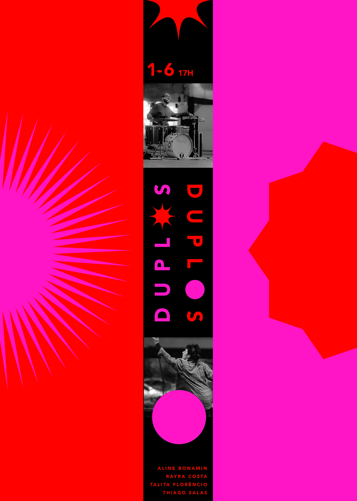
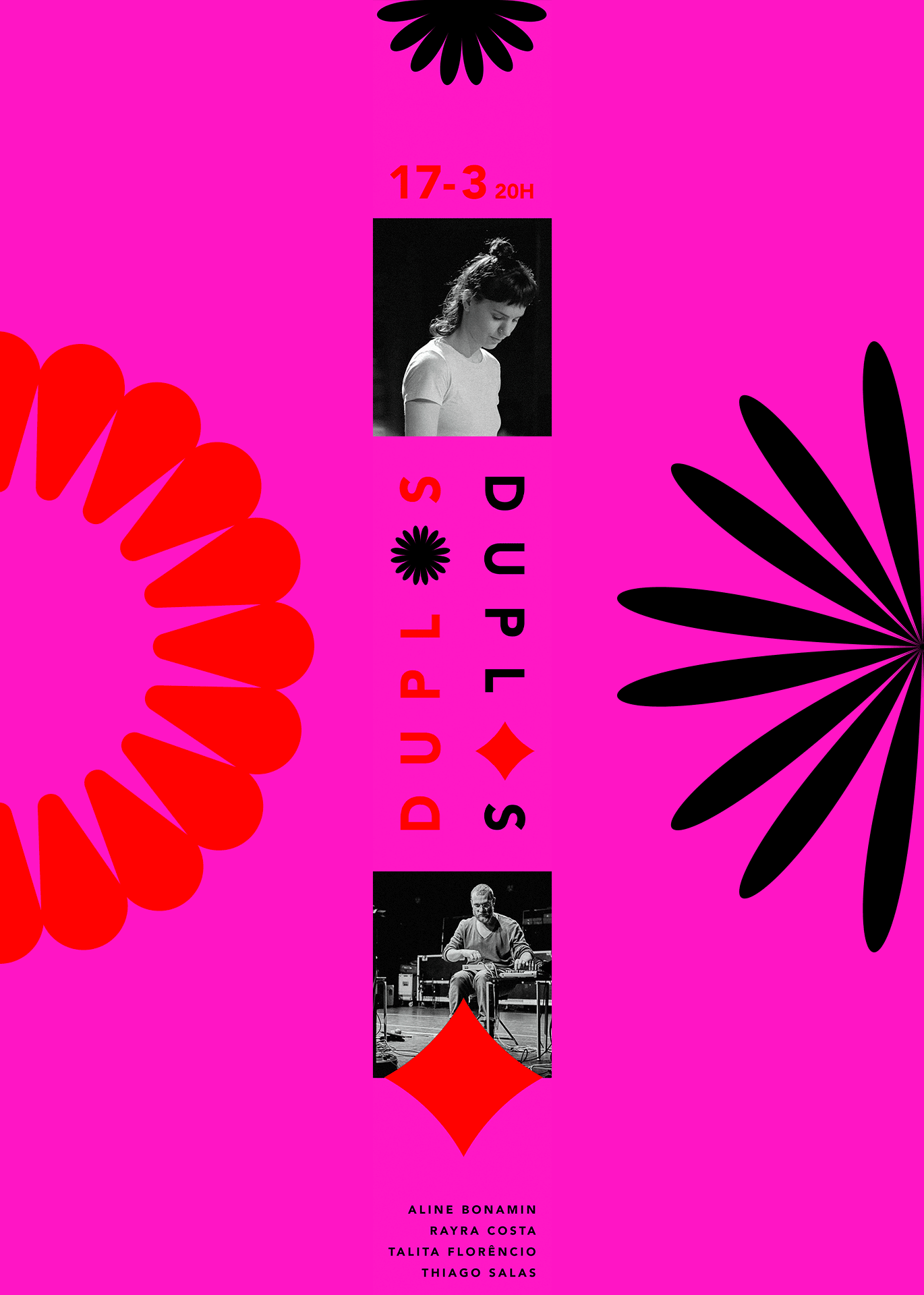
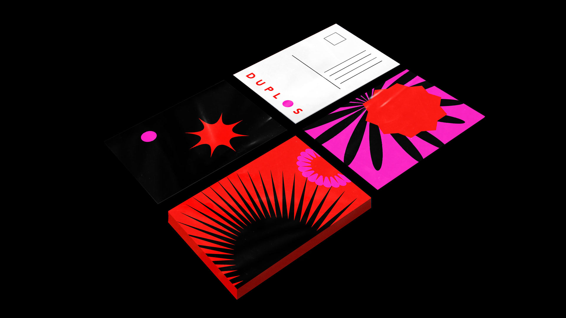
Para criar um sistema flexível e, ainda assim, robusto, foi desenvolvida uma marca que apresenta o nome do projeto em letras maiúsculas, com a letra "O" substituída por um círculo, simbolizando o ponto de partida para a mudança. Foram estabelecidas duas situações distintas: uma representada pela tipografia mais rígida e outra pelo dinamismo do círculo. Além disso, foram adicionadas as cores vermelho e rosa, por serem vibrantes, e o preto, para criar contraste.
To create a flexible yet robust system, the brand was developed with the full name of the project written in block letters, except for the “O”, replaced by a circle that stands for the starting point for change. It presents two distinct situations: one represented by the more rigid typography and the other by the dynamism of the circle. Additionally, the colors red and pink were chosen for their vibrant character, and black for creating contrast.
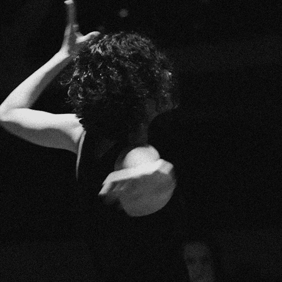
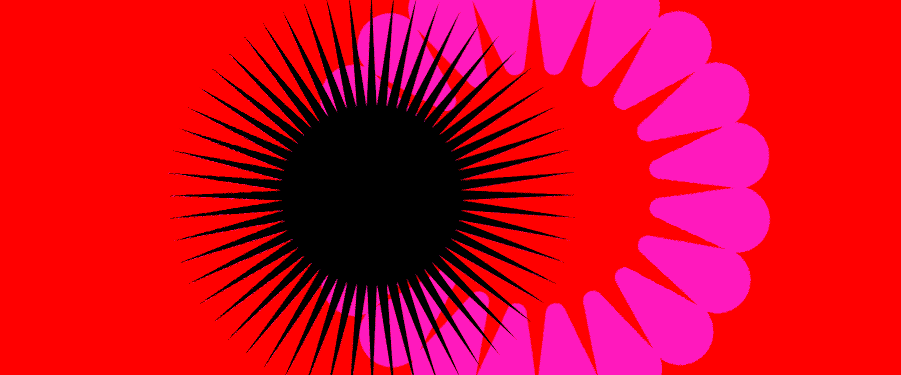
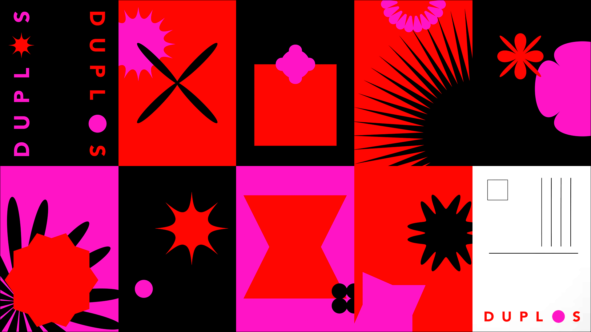
O sistema tem inspiração nas performances promovidas pelo projeto: a tipografia e as cores representam o território onde se desenvolvem as possibilidades de composição e movimento dos ícones, que representam as práticas de dança e música. Para cada uma das pessoas participantes, foi desenhado um ícone único a partir da forma circular inicial, representando a singularidade de cada artista.
The system draws inspiration from the performances promoted in the project: the typography and colors represent the territory where the possibilities of composition and movement of the icons take place, which stand for the practices of dance and music. For each of the participating artists, a unique icon arises from the initial circular form, representing the singularity of each person.
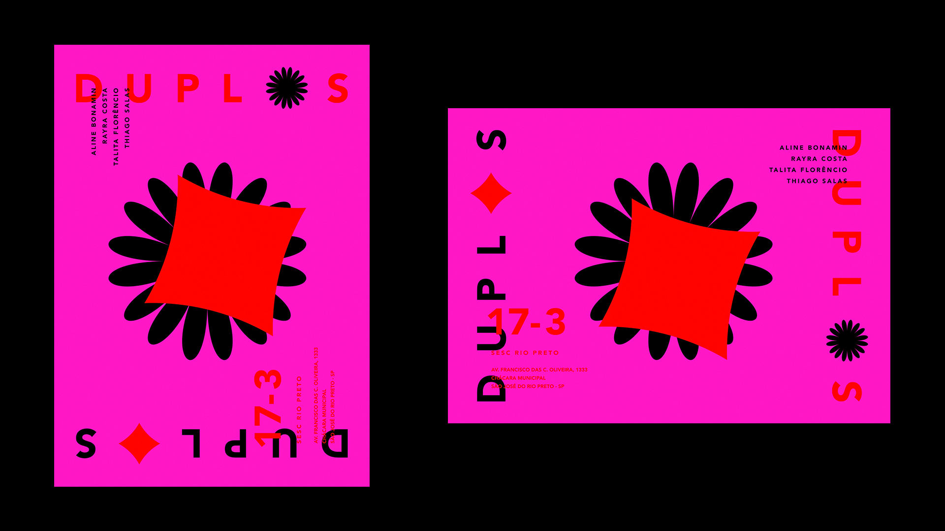
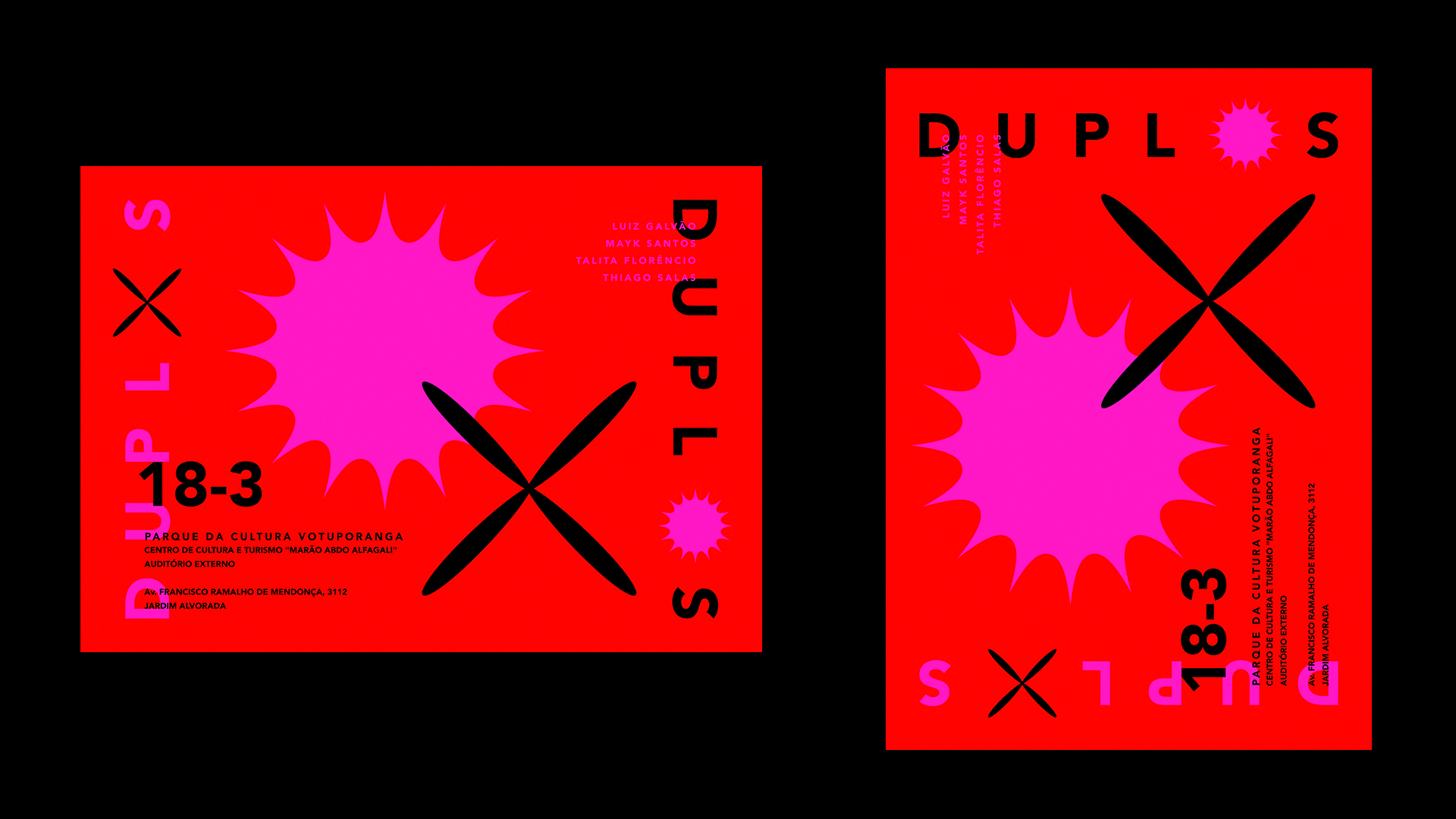
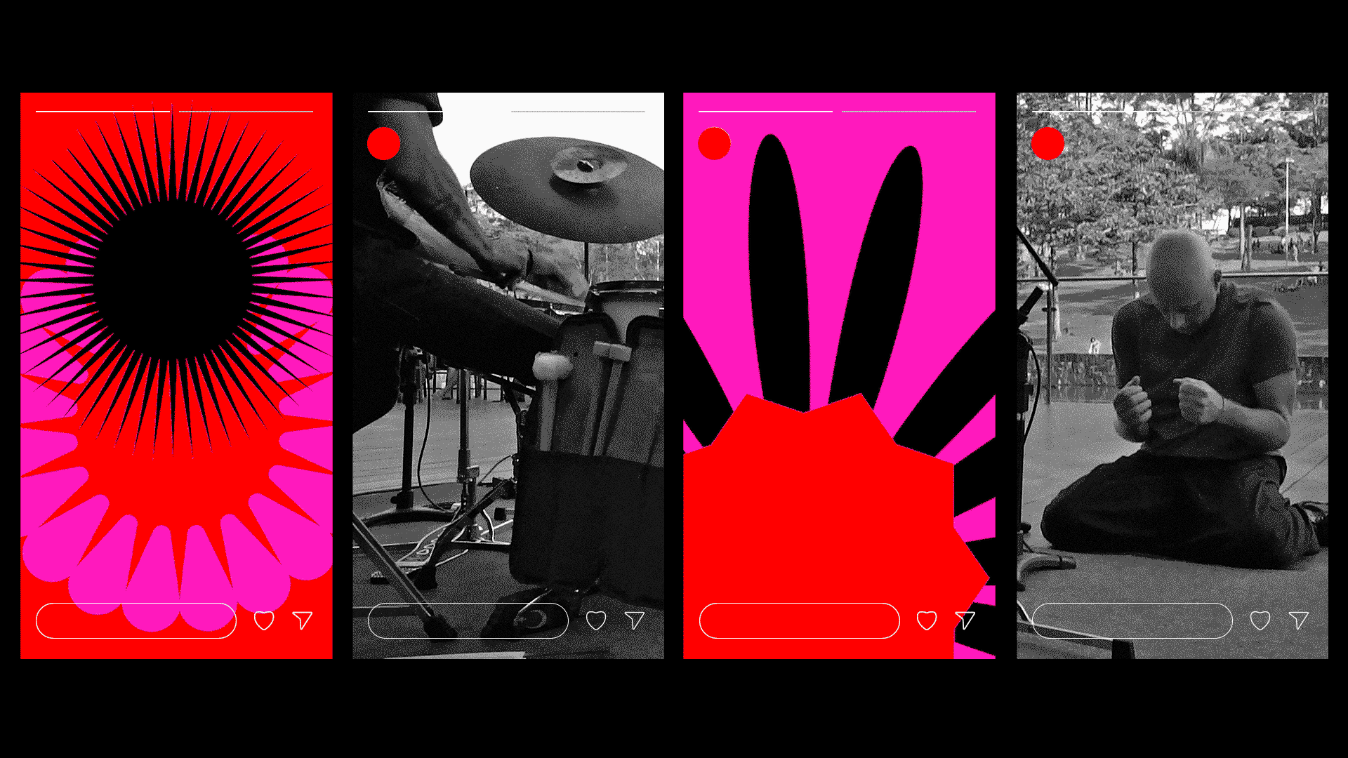
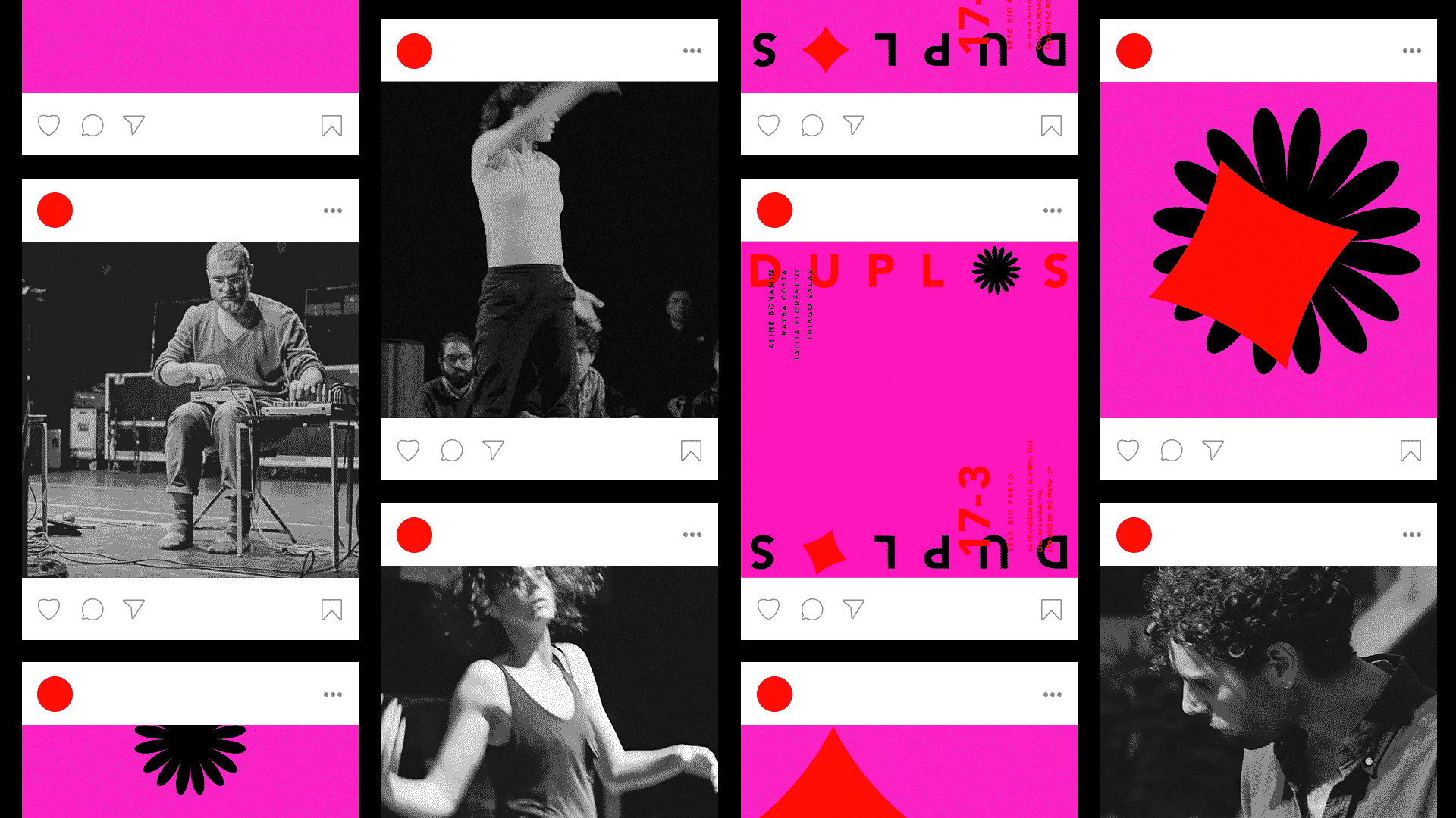
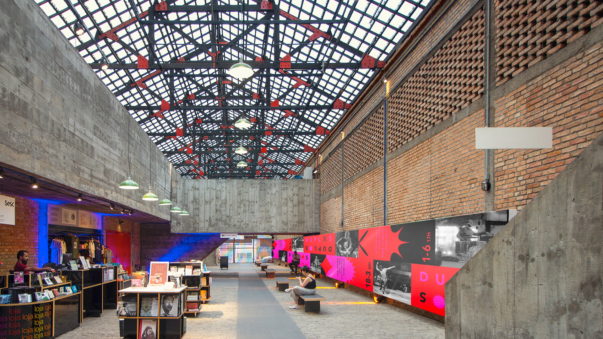
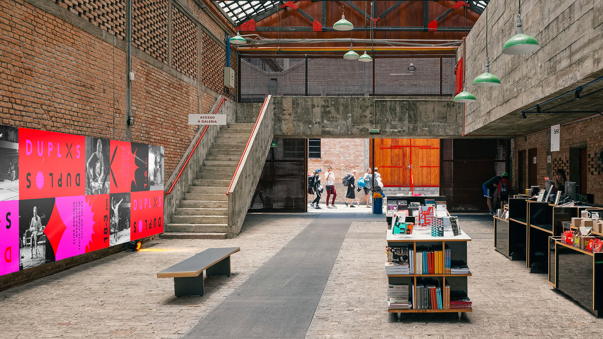
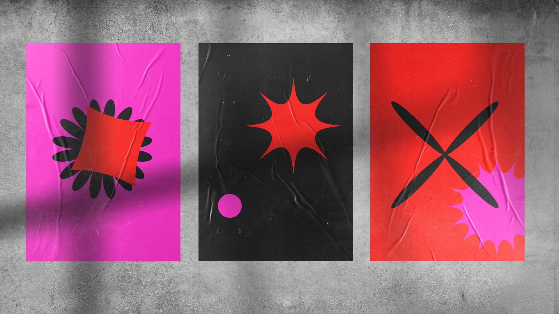
A montagem das peças de comunicação dos encontros segue a seguinte estrutura: é utilizado o espelhamento da marca, substituindo o círculo dinâmico por um novo ícone em cada uma das marcas. As cores são adicionadas seguindo uma lógica cíclica, onde se o fundo das peças do evento anterior foi vermelho, o próximo será preto, seguido pelo rosa, e então o terceiro será novamente vermelho.
To develop the communication materials for each encounter, the brand is mirrored, replacing the dynamic circle for a new icon in each of the brands. The use of the colors follow a cyclical logic in which, if the main color of the previous event was red, the next one is black, followed by pink, and then red again.
To develop the communication materials for each encounter, the brand is mirrored, replacing the dynamic circle for a new icon in each of the brands. The use of the colors follow a cyclical logic in which, if the main color of the previous event was red, the next one is black, followed by pink, and then red again.
A composição escolhida e a lógica do espelho permitem que a maioria das peças possa ser lida tanto na horizontal quanto na vertical.
The composition chosen and the mirroring allow most of the materials to be read horizontally as well as vertically.
The composition chosen and the mirroring allow most of the materials to be read horizontally as well as vertically.


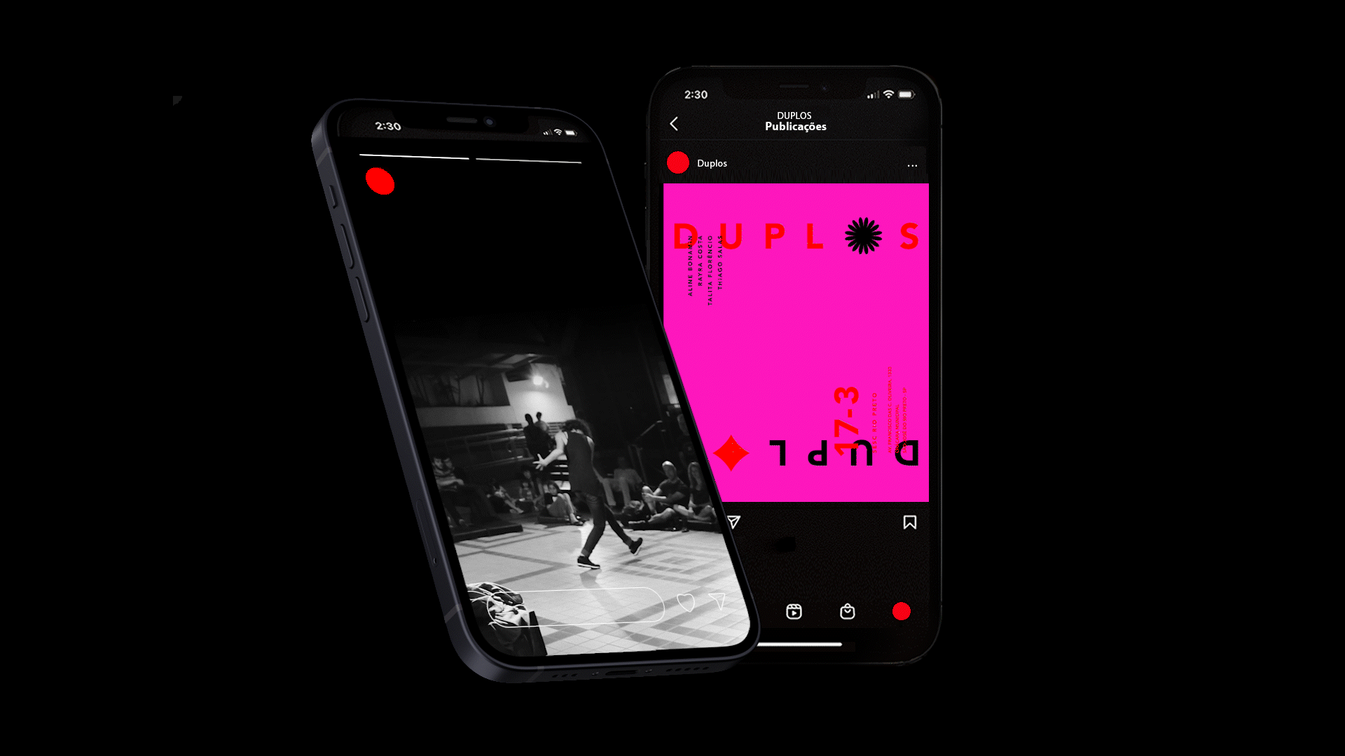
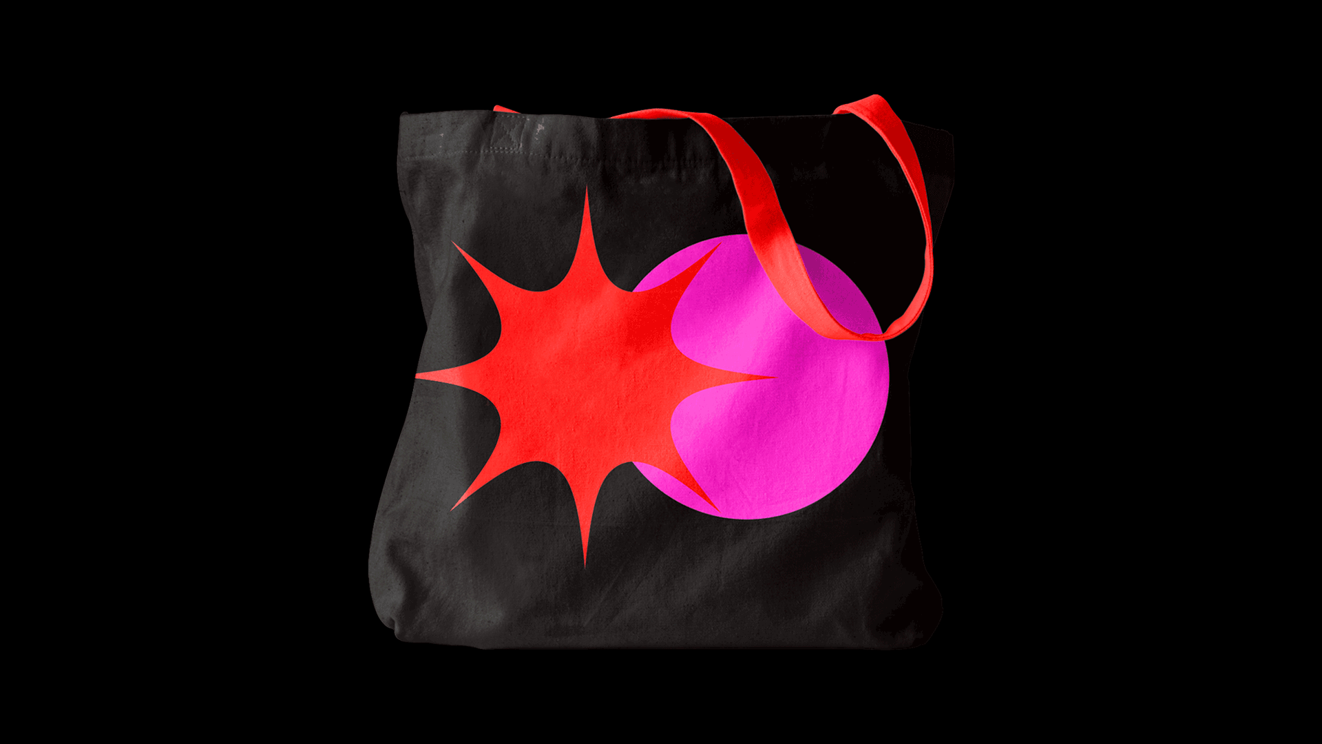
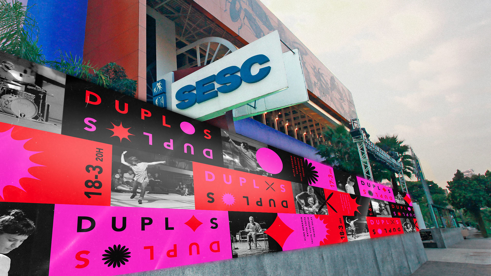
Esse sistema flexível ganha ainda mais força nas peças de redes sociais, pois transmitem exatamente o conceito do projeto, que lida com a indeterminação, o acaso, a escuta e a produção de presença entre a linguagem sonora e corporal. Por meio dessas peças, é possível comunicar a essência do projeto e criar uma conexão com o público, destacando a interação entre linguagens de forma dinâmica e impactante.
This flexible system becomes even stronger in the social media tiles for transmitting the exact concept of the project, which deals with indetermination, chance, hearing, and the production of presence through the languages of sound and body. Through these materials, it’s possible to communicate the essence of Duplos and create a connection with the audience, highlighting the interaction between languages in a dynamic and impactful way.
As edições em sua grande maioria, teve como apoio uma das instituições mais relevantes do país, o SescSP. Transitando por unidades como SesC Pompéia, Vila Mariana, Campinas, Pinheiros, Interlagos, Consolação, Santana, e Sorocaba.
The majority of the editions were supported by one of the most relevant institutions in the country, SescSP. Moving through locations such as Sesc Pompéia, Vila Mariana, Campinas, Pinheiros, Interlagos, Consolação, Santana, and Sorocaba.

DUPLOS
Identidade visual e campanha
Visual identity and campaign
Direção criativa e direção de arte/Creative direction and art direction:
Iago Mati
Design e motion/Design and motion desgin:
Iago Mati
Idealização e direção artística de Duplos/Conception and artistic direction of Duplos:
Talita Florêncio e Thiago Salas
Artistas participantes/Participating artists:
Beatriz Sano, Jorge Peña, Aline Bonamin, Thomas Rohrer, Patricia Bergantin, Paulo Hartmann, Eduardo Fukushima, Rogério Costa, Patrícia Árabe, André Damião, Érica Tessarolo, Felipe Merker, Nina Giovelli, Loop B, Cristian Duarte, Luiz Galvão, Key Sawao, Jussara Miller, Juliana Moraes, Alexandre Zamith, Pedro Macedo, Manu Falleiros, Ricardo Iazzetta, Flávio Lazzarin, Maurício Florez, Rodrigo Olivério, Isis Andreatta, Eduardo Contrera, Danielli Mendes, Dudude Herrmann, Raul Rachou, Alex Dias, Clarice Lima, Flora Holderbaum, Rafaela Sahyoun, Henrique Iwao, Rogério Martins, Jorge Garcia, Leandro de Souza, Tom Monteiro, Mario Del Nunzio, Flávia Pinheiro, Hedra Rockenbach, Maristela Estrela, Rayra Costa, Mariana Lemos e Migue Antar.
